• Home(ed)
  • Portfolio
  • Balinavian
  • Press
    • Press
    • Press inquiries
  • About
    • About us
    • Our team
    • The Scandinavian Style Savant
  • Contact
    • Contact us
    • Newsletter
Scandinavian interior design & decoration
  • Home(ed)
  • Portfolio
  • Balinavian
  • Press
    • Press
    • Press inquiries
  • About
    • About us
    • Our team
    • The Scandinavian Style Savant
  • Contact
    • Contact us
    • Newsletter

The 60/30/10 + B/W Formula: A Foolproof Way to Add Color to Your Home

Photo from mydesigndays.com

Are you tired of adding color to your home only to find that it overwhelms your space and clashes with your furnishings? If so, you're not alone. Many homeowners struggle to incorporate color into their homes without creating chaos. However, there is a simple formula that can help: the 60/30/10 + B/W model.

The 60/30/10 + B/W model is based on the golden ratio and provides a blueprint for balancing colors in a room. The idea is to separate colors into harmonious blocks, creating balance between the various colors and shades in the scheme. This prevents any one element from taking over the whole show.

To understand the formula, consider the proportions of a suit:

  • 60 percent comprises the jacket, pants, and vest.

  • 30 percent is the shirt.

  • 10 percent is the tie and pocket handkerchief.

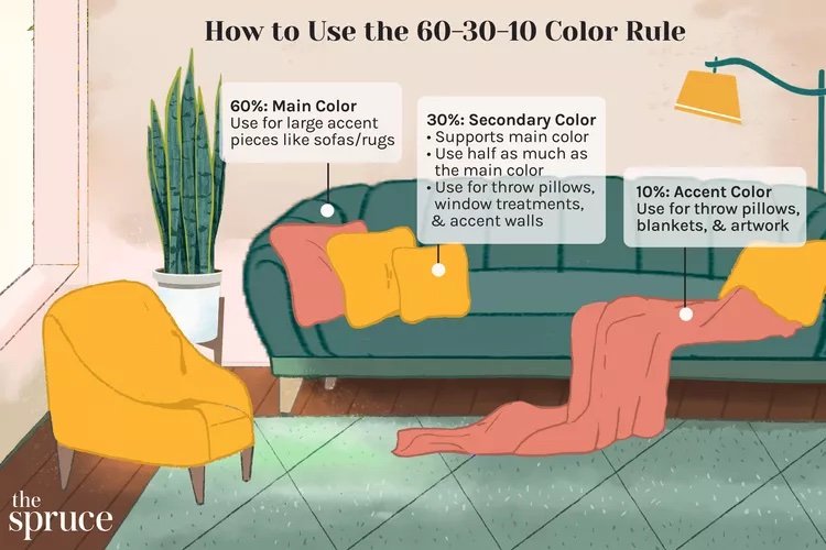
We can apply the same approach to a room:

  • 60 percent of the room will be in one or two main colors.

  • 30 percent of the room will be in subtle and harmonious accent colors, the purpose of which is to lift the main color(s).

  • 10 percent of the room will be spiced up with one or two contrasting colors.

    • B/W stands for one small black or white detail, which is necessary to give vigor to the chosen colors.

Timeless color rule. Photo from The Spruce

By following this formula, you can add color to your home without overwhelming your space. The key is to distribute the colors proportionally, so that each color has a specific purpose and is not competing for attention.

For example, let's say you have a white sofa and want to add some color with pillows. Instead of scattering a couple of colorful pillows, try adding pillows in one or two main colors (60 percent), some subtle accent pillows in harmonious shades (30 percent), and a couple of contrasting pillows (10 percent). Then, add a small black or white detail, such as a throw or vase, to bring out the colors and add depth to the scheme.

mid-century-modern.png
mid-century-modern-2.png

Examples of the 60-30-10 rule. Photo from Design by KH

To finish of, the 60/30/10 + B/W model is a foolproof way to add color to your home. By following this formula, you can create a balanced and harmonious color scheme that will enhance your space without overwhelming it. So, next time you're struggling to incorporate color into your home, give the 60/30/10 + B/W formula a try!

tags: colors, interior design, Scandinavian Interior Design, inspiration
Monday 01.08.24
Posted by Simone Elderot
 

Color Your World: From RGB to CMYK and NCS - A Guide to Mixing and Matching Colors

Photo by Scott Webb on Unsplash

Color is a powerful design element that can set the tone and mood for a space. Whether you're decorating your home or designing a website, understanding color theory is essential. In this blog post, we will discuss the different color mixing systems and color schemes, and how they can be used in interior design.

Color Mixing Systems

There are two main color mixing systems: additive and subtractive. The additive system is used in digital media, such as TV, computer, and phone screens. It uses the primary colors red, green, and blue (RGB) to create all other colors. On the other hand, the subtractive system is used in the print industry and uses cyan, magenta, yellow, and black (CMYK) to create all colors.

The Natural Colour System (NCS) is another color mixing system that is based on how humans see color. It uses visual characteristics of colors instead of physical characteristics such as pigments or light rays. The NCS primary colors are yellow, red, blue, green, white, and black, and it is commonly used in the paint industry.

Photo by Robert Katzki on Unsplash

Color Wheel and Color Schemes

The color wheel is a visual representation of the relationship between colors. It contains 12 colors, including three primary colors (red, blue, and yellow), three secondary colors (purple, green, and orange), and six tertiary colors. Neutral colors, such as black, white, and gray, are not part of the color wheel but can be used to create different tones.

Complementary colors are colors that are directly opposite each other on the color wheel, such as yellow and purple, blue and orange, and red and green. When combined, they reinforce each other and create a strong contrast.

Warm colors, such as yellow, orange, and red, are considered to be energizing and inviting, while cool colors, such as blue, green, and purple, are calming and soothing.

A color scheme is a conscious choice of colors used in a space or design project. Designers and stylists often use a palette of colors to achieve a specific style or feel. The Natural Colour System (NCS) and Pantone system are commonly used in interior design for color coding.

Photo by Jason Leung on Unsplash

Conclusion

Understanding color theory is crucial for interior design. By understanding color mixing systems, the color wheel, and color schemes, you can choose the right colors to set the tone and mood for a space. Experiment with different color combinations to find the perfect palette for your design project.

tags: colors, Scandinavia, Scandinavian Interior Design, RGB, CMYK, NCS, Guide to mixing and matching colors, complementary colors, color wheel, color schemes, color mixing system, interior design
Monday 03.27.23
Posted by Simone Elderot


Work

Portfolio

How we work

Press

About

Our Team

Reviews

Our Ethos

Contact

Contact Us

FAQ

Client form

Sign up for our Newsletter

Tack så mycket for subscribing!


© All rights reserved Stockhomed 2024